Chart Serializers#
A ChartSerializer object can be passed to any Chart component as a argument for value or defer:
- ::
- class DemoDashboard(Dashboard):
chart_example_value = Chart(value=ExampleChartSerializer) chart_example_defer = Chart(defer=ExampleChartSerializer)
…
Serializers automatically fetch and convert data into a format which can be rendered by the Chart component.
Creating a Chart Serializer#
To create a Chart Serializer all you need to do is: inherit from ChartSerializer, define your data
and implement a to_fig method.
Data#
If your data is stored in a Django model, the defining your data step becomes really easy. Either set the Model you’re interested in (in the serializers Meta class), or if you need more control over the queryset you can override the get_queryset() method.
When working with querysets and models you should also define fields in the Meta class.
This is a list of fields on your model which you are interested in. Under the hood
the serializer also converts your queryset into a Pandas Dataframe so is
required for this.:
from dashboards.component.chart import ChartSerializer
from yourapp.models import ExampleModel

class ExampleChartSerializer(ChartSerializer):
    class Meta:
        title = "Example Chart"
        fields = ["key", "value"]
        model = ExampleModel
    ...
or:
from dashboards.component.chart import ChartSerializer
from yourapp.models import ExampleModel


class ExampleChartSerializer(ChartSerializer):
    class Meta:
        title = "Example Chart"
        fields = ["key", "value"]

    def get_queryset(self, *args, **kwargs):
        return ExampleModel.objects.filter(value__gt=10)
    ...
Both these examples assume you have a Django model with a key and value field:
class ExampleModel(models.Model):
    key = models.CharField(max_length=25)
    value = models.IntegerField(default=0)
    ...
When overriding get_queryset() you also have access to any GET or POST data as well as request via the kwargs:
def get_queryset(self, *args, **kwargs):
    filters = kwargs["filters"]  # any GET / POST data
    request = kwargs["request"]  # django request object

    qs = ExampleModel.objects.all()
    qs = qs.filter(created_by=request.user)
    qs = qs.filter(key=filters.get("key"))

    return qs
If your data doesn’t come from a Django model you can still use serializers to prepare your data for Charts.
To do this just override the get_data method on the serializer for example below we pull a pandas Dataframe
example from plotly express.:F
This example returns data from the in-built Pandas function medals_long().
Just like get_queryset(), get_data() also has access to any GET or POST data as well as the request in kwargs.:
def get_data(self, *args, **kwargs):
    df = px.data.medals_long()
    filters = kwargs["filters"]  # any GET / POST data
    df= df.query(f"medal" == '{filters["medal"]}'")

    return df
get_data expects that you return a Pandas Dataframe.
to_fig#
to_fig() defines how to convert your raw data into something which the chart can display.
It accepts 1 argument, a Pandas Dataframe (which is what your queryset gets converted to).
Under the hood the Chart component uses Plotly to display charts so it expects
you to return a plotly Figure object, hence the name to_fig.
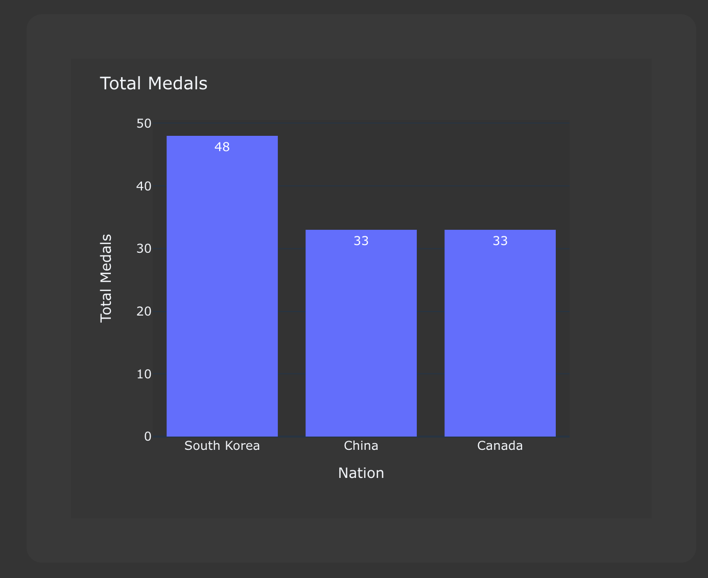
class ExampleChartSerializer(ChartSerializer):
    class Meta:
        title = "Total Medals"

    def get_data(self, *args, **kwargs):
        df = px.data.medals_long()
        return df

    def to_fig(self, df):
        fig = px.bar(
            df,
            x="key",
            y="value",
        )

        return fig

This example displays a bar chart with ``key`` values along the x-asis and ``value`` values in the y-axis.:
We deliberately left to_fig unimplemented so you can have final say over
which charts you require.
However we understand that defining to_fig on every Serializer can become tedious, especially if they are all the same, so we recommend creating some Base serializer classes for each chart type you require. e.g.:
import plotly.express as px
import plotly.graph_objects as go

class ScatterChartSerializer(ChartSerializer):
    x: Optional[str] = None
    y: Optional[str] = None
    mode: Optional[str] = "lines+markers"

    def to_fig(self, df) -> go.Figure:
        fig = px.scatter(
            df,
            x=self.x,
            y=self.y,
        )
        fig = fig.update_traces(
            mode=self.mode
        )

        return fig


class BarChartSerializer(ChartSerializer):
    x: Optional[str] = None
    y: Optional[str] = None
    color: Optional[str] = None
    orientation: Optional[str] = "v"
    barmode: Optional[str] = "stack"

    def to_fig(self, df) -> go.Figure:
        fig = px.bar(
            df,
            x=self.x,
            y=self.y,
            color=self.color,
            orientation=self.orientation,
            barmode=self.barmode,
        )

        return fig
This simple example gives you 2 chart types: Bar and Scatter, which you can then build your serializers from e.g.:
class ExampleBarChartSerializer(BarChartSerializer):
    x = "key"
    y = "value"

    class Meta:
        title = "Example Bar Chart"
        fields = ["key", "value"]
        model = ExampleModel

class ExampleScatterChartSerializer(ScatterChartSerializer):
    x = "key"
    y = "value"

    class Meta:
        title = "Example Scatter Chart"
        fields = ["key", "value"]
        model = ExampleModel
Layout#
When creating a Serializer you can define a title, width and height in the Meta class.
If set, the title is shown on the chart and width and height define its size.:
...
class Meta:
    title = "Example Chart"
    width: 500
    height: 500
This gives some control over the chart display but if you want further control you can set a layout dictionary on your serializer:
class ExampleChartSerializer(BarChartSerializer):
    x = "nation"
    y = "count"
    layout = dict(
        xaxis_title="Nation",
        yaxis_title="Total Medals",
        font=dict(family="Courier New, monospace", size=14, color="RebeccaPurple"),
    )

    class Meta:
        title = "Total Medals"

    def get_data(self, *args, **kwargs):
        df = px.data.medals_long()

        return df
This allows you to change the total look and feel of any chart. See the Plotly documentation for a full list of parameters you can set - https://plotly.com/python/reference/layout/